Main Type Of Layouts For Convenience Stores
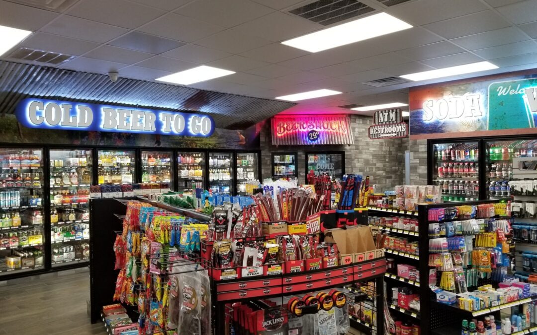
As a convenience store owner, you know that the physical layout of your store is essential. What customers see and how they navigate your spaces significantly affects their shopping experience and even what and whether they purchase. You probably didn’t know the sheer number of layout types for convenience stores. Let Jay Comp Development guide you on the different styles of stores and which one might be best for you.
Finding the Right Layout
You want an environment that drives customers to purchase your products. To do this, you need to use all the floor space you can for your goods. The layout should guide your customers along an advantageous journey; you can’t sacrifice utility for aesthetics. Fortunately, there are many different configurations that you can choose from based on your needs.
Forced-Path Store Layout
The first type of store layout is the forced-path layout. As the name suggests, this means that customers are guided along a specific path to funnel them towards strategic product placements. This layout is most commonly seen in supermarkets and larger stores because it allows for more effective placement of high-margin items. You can achieve a uniform and efficient customer flow that promotes higher sales with a forced-path layout, but this plan may be too cramped for smaller stores. However, forcing customers to pass by so much merchandise increases the odds that a customer will make an unplanned purchase.
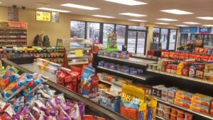
Grid Store Layout
The grid store layout is probably the most common type of convenience store layout, favored by drug and hardware stores. It involves a simple grid pattern with aisles perpendicular to the front door. This layout allows customers to easily navigate the store and find what they’re looking for without getting lost. Another advantage is that it simplifies your inventory control, setting you up for maximum profitability. Proper signage is essential to grid store layouts since it helps to guide customers through the grid.
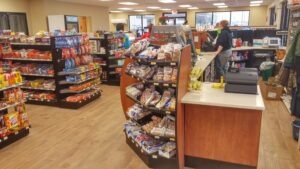
Loop Store Layout
The loop (or racetrack) store layout is similar to the grid, but instead of having aisles that run perpendicular to the front door, they run parallel. Though best used for larger stores (5,000 square feet or more), it is a versatile design because it encourages a clearly visible customer path. Signage, lighting, and displays to guide customers along the loop are vital.
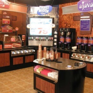
Straight Store Layout
The straight store layout is the most efficient use of space, and it is simple to plan, making it a favorite of liquor and convenience stores and small markets. This design helps pull customer attention to displays and merchandise featured at the back of the store. As with loop store layouts, having good signage, displays, and lighting is vital for directing customer attention.
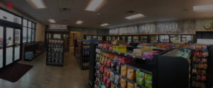
Diagonal Store Layout
The diagonal store layout is similar to the straight store layout, but the aisles are arranged at an angle to ensure customers can view as many items at a time as possible. Diagonal store layouts are ideal for small stores, particularly self-service retailers since the layout is easy to move around in with a central and elevated checkout area for better visibility. Make sure not to make your diagonal aisles too narrow for comfortable shopping.
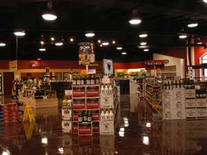
Angular Store Layout
The angular store layout spotlights products. In this type of layout, the walls and corners are curved, and merchandise displays are rounded. This layout is typical in luxury stores because customers almost always notice freestanding merchandise displays. The downside to this layout is that it is inefficient with space, but there is no questioning that the design is unique and memorable.
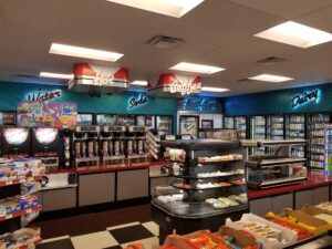
Geometric Store Layout
The geometric store layout appeals to younger customers like Millennials, and Gen Z. This layout is both artistic and functional, blending features like wall angles, support pillars, and ceiling styles with aesthetics. Clothing and apparel stores are most likely to use this layout, pairing it with “environmental” strategies like music, perfume scents, and artwork to create distinct branding for the store.
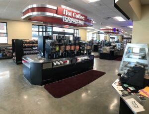
Mixed Store Layout
The mixed store layout is a combination of any two or more store layouts. These layouts can be flexible, so they are favored by department stores and supermarkets to create a dynamic customer flow. A grocery store might feature a grid layout for dry goods but put high-value items like wine and imported cheese on angular displays that attract attention. The mixed store layout can be very effective if done appropriately, but space and resource constraints can make this difficult.
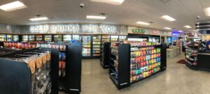
Free Flow Store Layout
The free flow store layout allows customers to move freely throughout the store. This layout does away with influencing customer purchasing decisions, encouraging customers to spend more time in the store. A free flow layout is aesthetically appealing, but the layout may be confusing to customers.
Boutique Store Layout
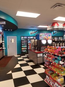
The boutique (or alcove) store layout is a type of free flow store layout designed to create a feeling of intimacy and exclusivity. In this type of layout, merchandise is separated into categories, and customers are encouraged to interact with goods on display. The boutique store layout is most often used by wine sellers, gourmet markets, and, of course, boutique retailers. Like the more typical free flow store layout, a boutique layout can be confusing and inefficient, but it tends to create a fun experience for the customer.
Plan Your Store Layout with Jay Comp Development
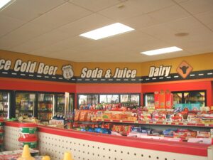
At Jay Comp Development, we have the experience and products to turn your store layout dream into a reality. We stock a wide range of new products and graphics to enhance the shopping experience, and we are experts at integrating new ideas like the Beer Cave. Jay Comp Development handles any job, from small equipment add-ons to complete remodeling projects. Contact Jay Comp Development today, and get your layout organized!

