What Makes A Good Store Layout?
When it comes to your store design, the layout is vital. You want to ensure that your customers can easily find what they are looking for and have a positive shopping experience. This blog post will discuss some factors that make a suitable store layout. We will also provide some tips on how you can create a layout that works for your business! Let Jay Comp Development guide you on the aspects you need to consider when designing your store’s layout.

Store Layout Design Tips
There is no one-size-fits-all solution to retail store layouts. Different layouts work better for different kinds of stores. However, there are some commonalities that all store designers should consider when deciding how their store should be laid out. Remember that humans are visual creatures: half of our brains are devoted to understanding visual information, and 65% of people are visual learners. What customers see outside of and upon entering your store is very important.
Consider your customer flow
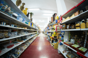
You want customers to be able to move easily throughout your store without feeling cramped or lost. There should be a logical flow from the entrance to the exit and everything in between. Make sure there is enough space for customer traffic and that your aisles are wide enough for customers (and their carts) to move through easily. Be aware that customers tend to turn right after entering a store.
Prioritize your window display
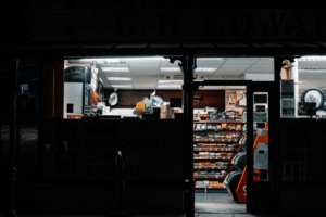
Your store windows are like a giant billboard advertising your store to potential customers. Make sure they are clean and well-organized and change them regularly to reflect current promotions and seasonal items. Remember, your window display is your opportunity to tell your brand story and distinguish yourself from your competitors.
Know your decompression zone
When customers walk into your store, they need a moment to adjust to their new surroundings. This area is called the decompression zone and should be free of obstacles or cluttered displays. Use this space to give customers a chance to orient themselves and make them feel welcome in your store. Try not to put any key products or signage in the decompression zone, as they are likely to go unnoticed by shoppers entering your store.
Incorporate speedbumps
Speedbumps are obstacles placed throughout the store that force customers to slow down and take a closer look at items on display. They can be anything from racks of sale items to displays of new merchandise. A sign that sticks out slightly into the aisle is an excellent speedbump that makes shoppers slow down and consider the products on the shelf from which the sign is jutting. This consideration stops your customers from skipping over displays and makes it more likely that they will make a purchase.

Match your layout with your business type
The layout of your store should be based on the type of business you have. Consider your store’s size, the products you sell, and your target market. For example, a store that sells high-end clothing would benefit from a more luxurious and spacious layout, while a store that sells inexpensive items would do better with a more compact and efficient layout. A few questions to ask yourself when matching your layout and business type are:
- Who are my customers?
- Will my customers value speedy or leisurely shopping?
- Will my customers prefer efficiency or exploration?
- Will my customers appreciate employee guidance, or would they prefer independence?
Don’t show too much or too little
You don’t want customers to feel overwhelmed by the amount of merchandise on display, but you also don’t want them to feel like they can’t find what they’re looking for. How much you put on display also depends on your store’s type. Boutiques specializing in high-end merchandise will likely have a relatively small number of products on display. On the other hand, a discount retailer will probably pack their space with merchandise to try to sell as much as possible.
Don’t clutter
You should design your store layout with your specific products in mind. For example, if you sell large items, you’ll need wide aisles and plenty of space for customers to move around. If you sell smaller items, you can get away with narrower aisles and less space overall. Either way, leave enough room for customers to move without brushing up against displays or each other.

Change your displays regularly
Your store layout should be flexible enough to accommodate changes in your product mix. If you’re constantly adding new products, you’ll need to be able to adjust your displays accordingly. This change means having shelves that are easy to move and rearrange. In any case, you should change your displays regularly to keep your customers’ interest.
Remember to cross-merchandise
Cross-merchandising is a technique that involves placing complementary products near each other. For example, if you sell clothing, you might want to place accessories nearby. This proximity makes it easy for customers to find everything they need in one spot.

The best store layout is one designed by Jay Comp Development
At Jay Comp Development, we are experts in what makes a good store layout. Our team crafts new and innovative ideas to help retail store owners make the most out of their business’s space with the latest designs and features. We are detail-oriented to ensure that your customers have a positive shopping experience that will keep them coming back again and again. Call us today to start laying out your store for maximum profitability and customer satisfaction.


